Many are excited about the responsive revolution, and just as many are switching to a mobile-first approach, whether we’re talking design, development, performance or analytics metrics.
Mobile is the big deal, and will be even bigger in 2016, there is no point denying this simple fact…
But as we continue to strive for that perfect mobile experience, we are forgetting the meaning of the word “responsive”. Let’s take a look at the first paragraph on Wikipedia (I know, I should use a more credible source, but as it stands, this is the truth):
“Responsive web design (RWD) is an approach to web design aimed at crafting sites to provide an optimal viewing and interaction experience— easy reading and navigation with a minimum of resizing, panning, and scrolling — across a wide range of devices (from desktop computer monitors to mobile phones)”.
I hope you get where I’m going with the bolds.
Responsive design is not only about small screens, and catering to trends of the mass market.
It is just as much about the big screen — probably not the one you’re reading this article on — but the one you use in your professional life.
Screen sizes aren’t just getting bigger, so are resolutions. 4K or Retina screens are becoming de facto in many high-end computers, and you should not count on that becoming any less significant in the future.
Let me give you a few examples of poor big screen execution, and 5 great examples of great design. All screenshots are from the 27″ 2560 x 1440 monitor in my home office.
…And before you grab your pen, The Fold is just a myth.
The Negative
Yeah, I know — You’ve got to go through these poor examples first, then the goodies will arrive… Scroll like you’ve never scrolled before.
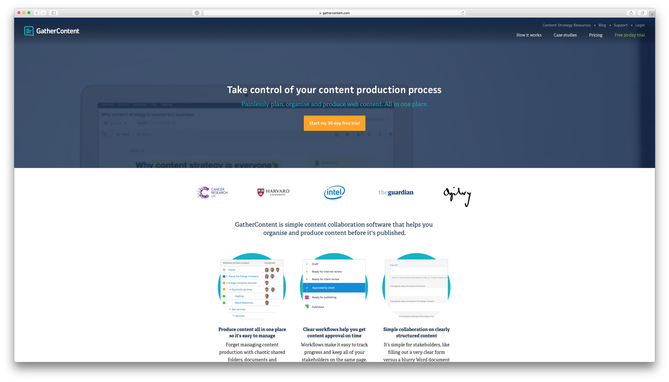
GatherContent.com — The background-playing video is impossible to watch, navigation is struggling and the whites are huge.
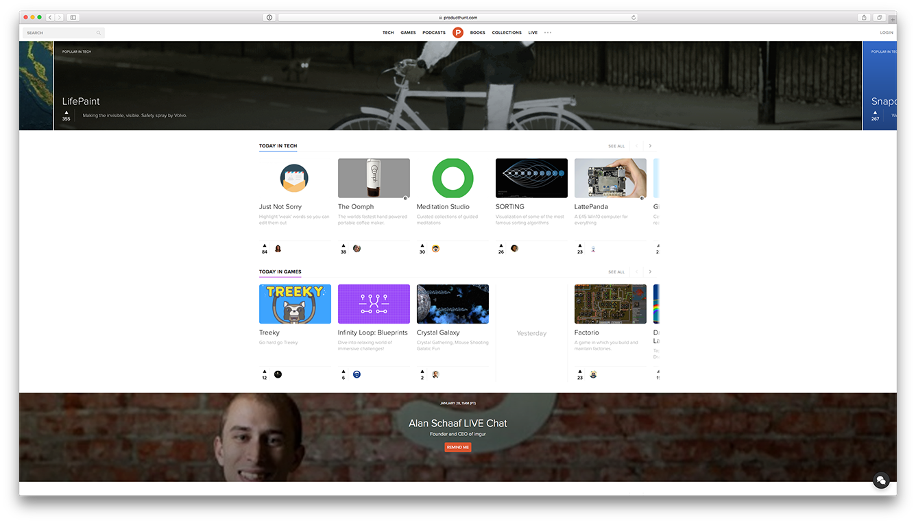
ProductHunt.com — Show more of the rest of the carousel (ugh, I know), and get more out of the grid. It’s easy to imagine how this can work a double or even triple the size of the images.
The Positive
Jaw-dropping full-width design-loving pieces of crafty pixels!
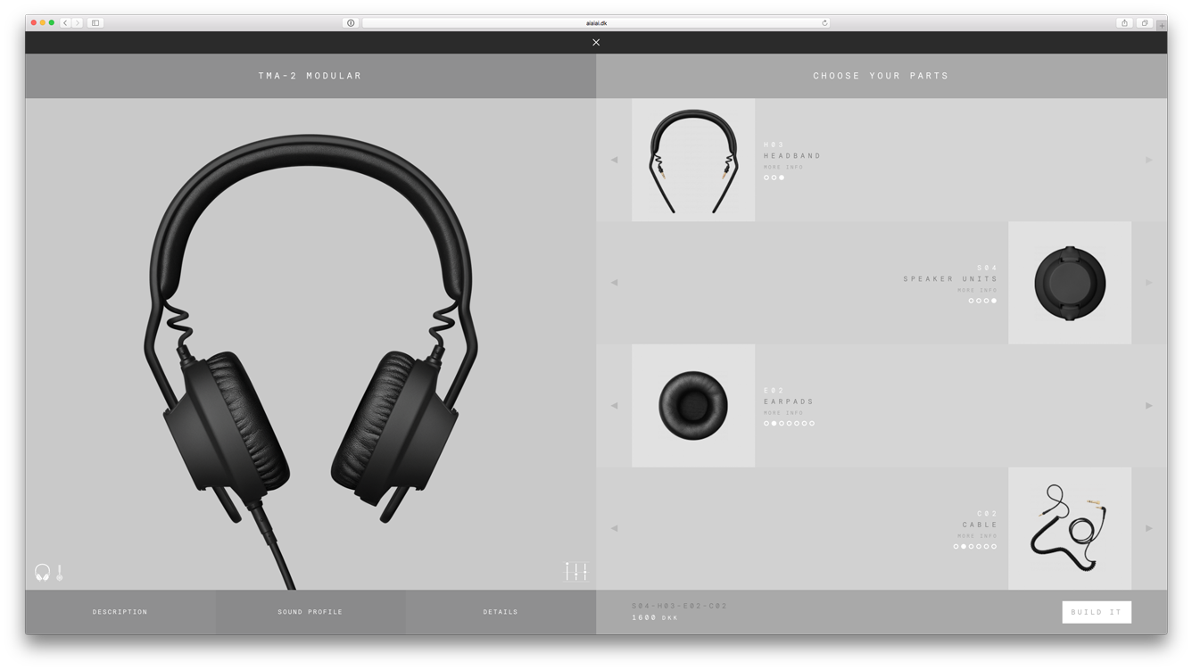
Aiaiai.dk — Fill up my screen with beautiful big pictures, so I can look at each detail before buying.
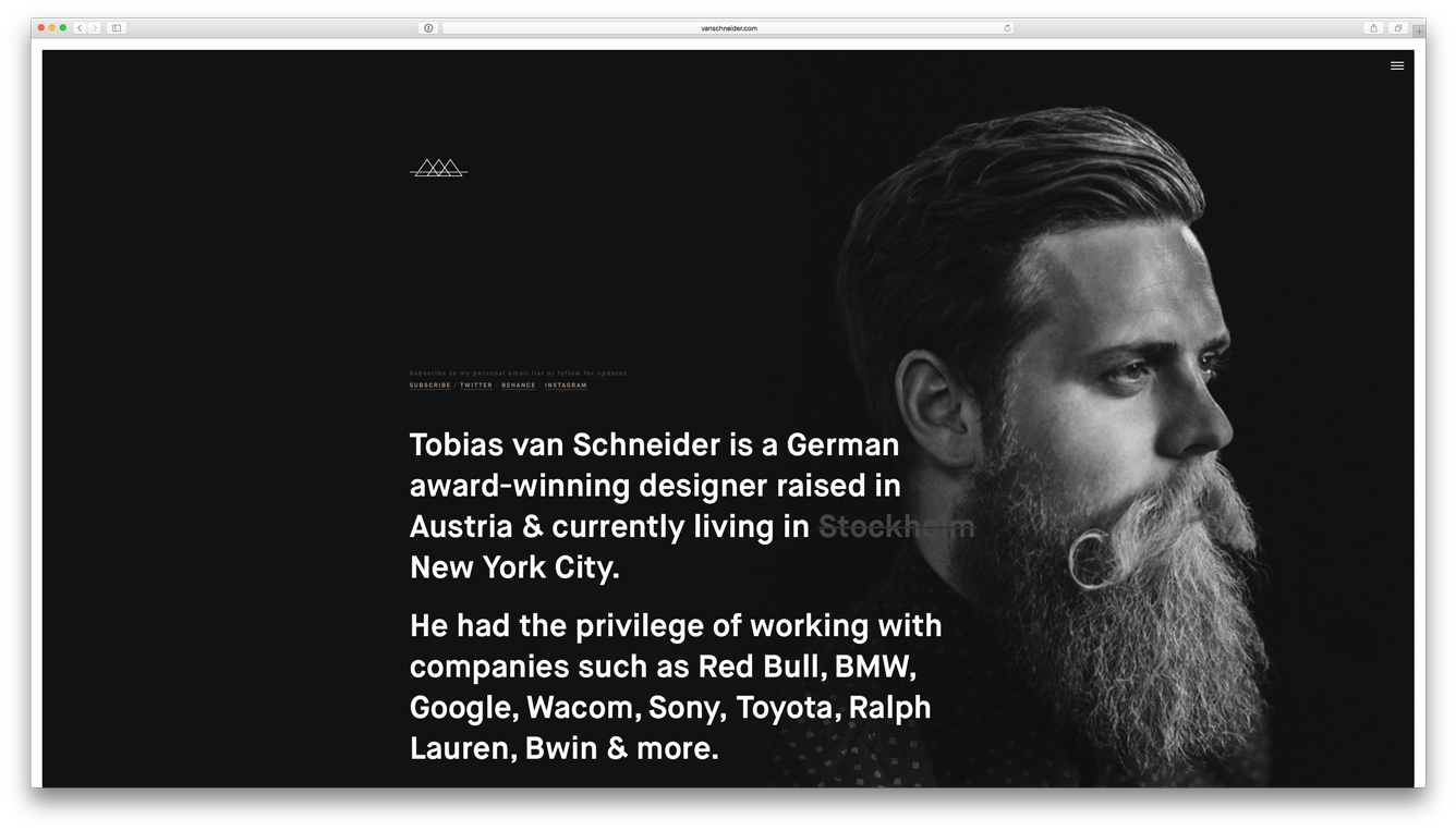
TobiasvanSchneider.com — Getting his message through with big typography.
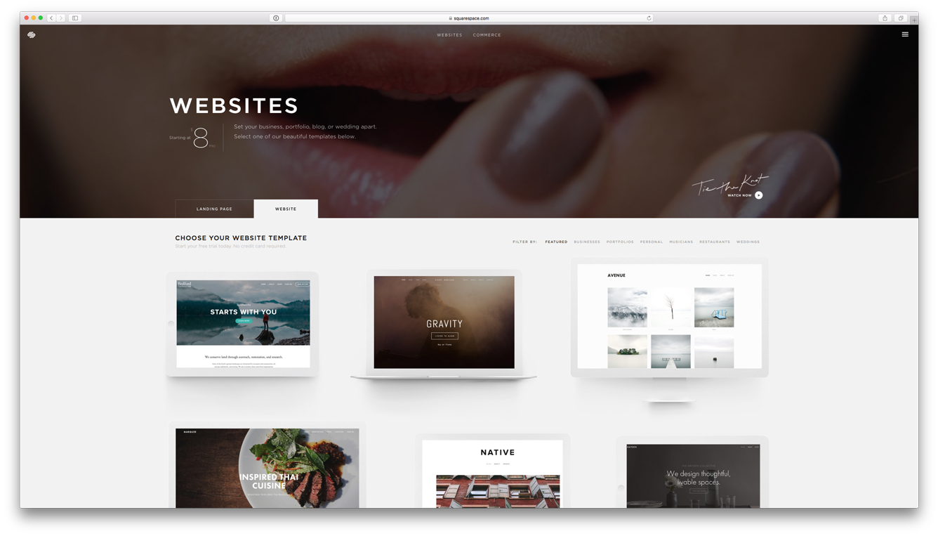
Squarespace.com — Unlike GatherContent they’re actually embracing their full background videos, giving it room to breathe and solving the “narrow” issue.
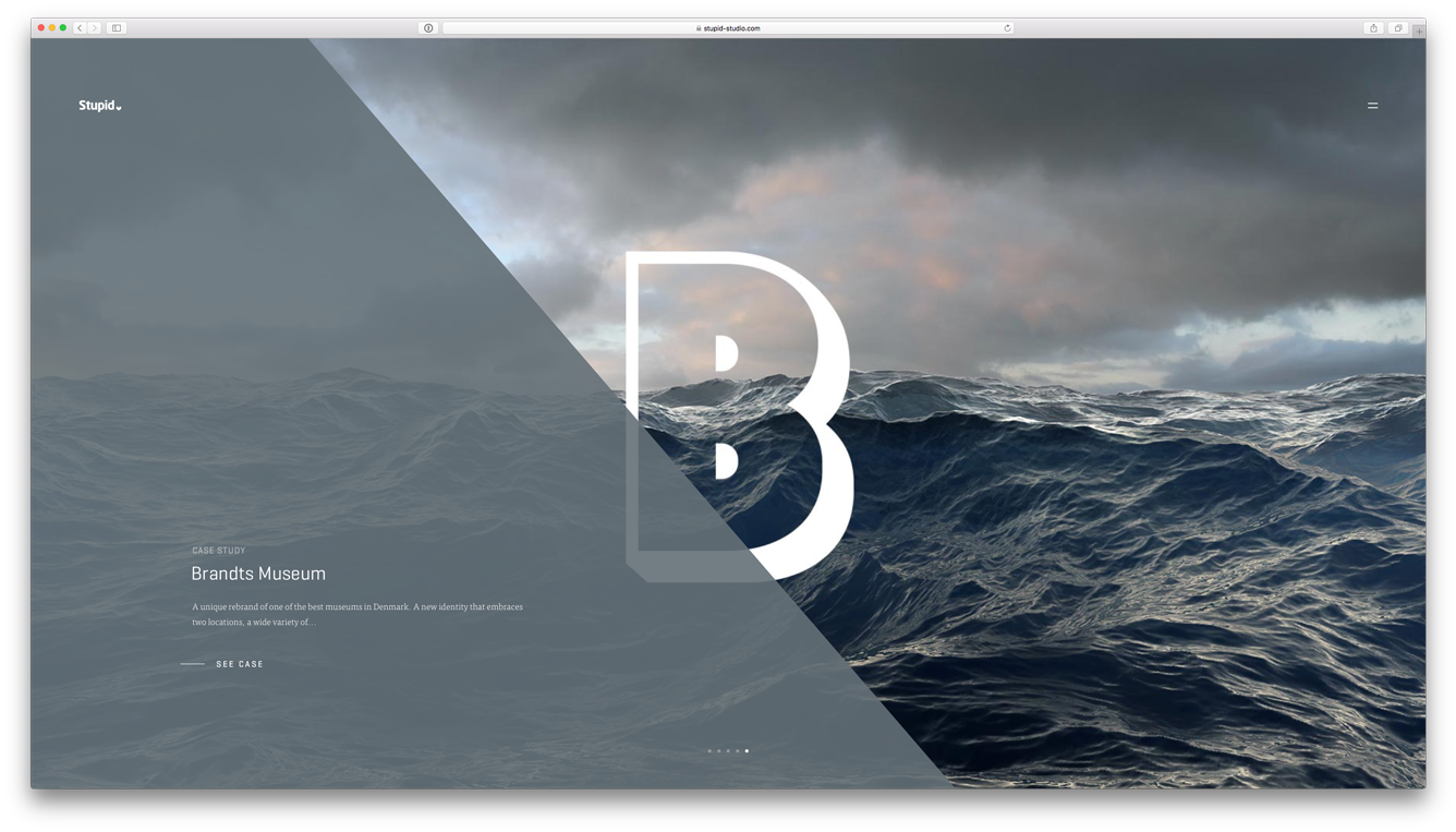
Stupid-Studio.com — If you haven’t got content for the big screen, be creative. Use images or graphics
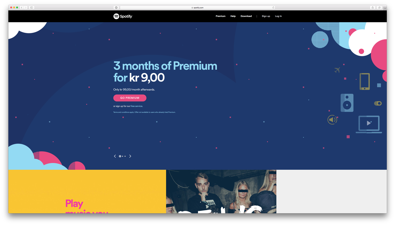
Spotify.com — A rather simple execution (there might be other flaws here), but an all-round good example on big screen design using illustrations.
I hope this has lit a little fire inside you and I encourage you to go out there and design for that huge screen, as well as the little one in your next project!
Do you agree? What are your thoughts on the big screen?
Reach out to me on Twitter.